【種樹】實作 CSS 凸顯文字內容: Alert 與 Highlighting

我目前 Github Page 採用的主題是 jekyll-theme-next ,我很喜歡這個主題。但唯一讓我不滿意的大概就是沒有凸顯內容文字的手段,只好自食其力了!

Alert

先上張結果圖,實作了六種顏色,分別為 default、primary、info、success、warning、danger。

Blog Alert

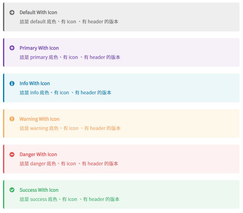
個人倒是很少用 default 與 primary。另外,Alert 左方的 icon 與上方的header,可以由撰寫者自己決定開或不開。

實作

在實作時我參考了 kanboo.github.io 的程式碼,雖然網站外觀看起來很相似,但它是用的是另外一套網誌框架 - hexo,所以那份程式碼不能直接移植 So sad :crying_cat_face:

不過看了一下沒有很難做,所以仿照這份程式做了一份:

1. 顏色

在開始前,先來設定外觀顏色。在 jekyll-theme-next 中客製化的顏色設定會統一放在 \_sass\_variables\custom.scss 中。

1
2
3
4
5
// Default
$alert-default-border        : $grey-dim;
$alert-default-bg            : $gainsboro;
$alert-default-text          : $alert-default-border;
$alert-default-icon          : "\f0a9";

其中 icon 是使用 Font Awesome 所提供的。可以到網站中找找自己喜歡的 icon,然後複製它的 Unicode,就可以套用了。

如果不是使用跟我一樣的主題,在開始前請在檢查是否有引入 Font Awesome

2. 本體

接下來決定外觀長怎樣,這部分是寫在 \_sass\_custom\custom.scss 中。下面只介紹部分程式碼,完整的程式碼會貼在本節之後。

  1. .post-body .alert
    為了限定是在文章中才會出現,所以我這邊用了多重選擇器來限縮選取。

  2. border、border-left、border-radius
    這區塊是為了畫出 Alert。因此先將它初始化後,指定約 4px 的實心線條畫出的左邊的邊框,最後再加上圓角柔和一下線條。

  3. background-color、border-left-color、color
    這邊則是指定了本體的底色、左邊框顏色與文字的顏色。不過不過,這邊只是預設的顏色,一旦指定新的選擇器,這邊就會被覆蓋掉。

  4. &:not(.no-icon)
    這個區塊則是設定 icon 的部分。開頭的&:是 sass 語法,對應到的是 css 的偽類別的語法。當它判斷沒有使用 no-icon 這個選擇器時,就會在前面加上 icon ,設定相對並設定相對應位置關係。一樣 content 與 color 會隨著不同的選擇器而變動。

    別忘了 font-family!
    就是這行 font-family: 'FontAwesome'; 害我找了好久的 bug.
  5. &.primary
    這邊就是剛剛提過會隨著不同選擇器而邊動的區塊。

1
2
3
4
5
6
7
8
9
10
11
12
13
14
15
16
17
18
19
20
21
22
23
24
25
26
27
28
29
30
31
32
33
34
35
36
37
38
39
40
41
42
43
44
45
46
47
48
49
50
51
52
53
54
55
56
57
58
59
60
61
62
63
64
65
66
67
68
69
70
71
72
73
74
75
76
77
78
79
80
81
82
83
84
85
.post-body .alert {
  position:             relative;
  padding:              15px;
  margin-bottom:        20px;

  // commit setting
  border:             initial;
  border-left:        4px solid; 
  border-radius: 4px;
  
  // default seeting
  background-color:   $alert-default-bg;
  border-left-color:  $alert-default-border;
  color:  $alert-default-text;

  a {
    color: $alert-default-text;
    border-bottom-color: $alert-default-text;
    &:hover {
      color: $alert-default-hover  ; 
      border-bottom-color: $alert-default-hover;
    } 
  }
  
  h2, h3, h4, h5, h6 {
      if note_icons {
        margin-top:       3px;
      } else {
        margin-top:       0;
      }
      margin-bottom:      0;
      border-bottom:      initial;
      padding-top:        0 !important;
    }
  
  p, ul, ol, table, pre, blockquote {
      &:first-child {
          margin-top:       0;
      }
      &:last-child {
          margin-bottom:    0;
      }
  }

  .head {
    font-weight:bold;
  }

  &:not(.no-icon) {
      padding-left:     45px;
      &:before {
        // common setting
        position:       absolute;
        font-family:    'FontAwesome';
        font-size:      larger;
        top:            13px;
        left:           15px;

        // default setting
        content: $alert-default-icon;
        color : $alert-default-text;
      }
    }

  &.primary  {
      background-color: $alert-primary-bg;
      border-left-color:  $alert-primary-border;
      color:  $alert-primary-text;
      a {
        color: $alert-primary-text;        
        border-bottom-color: $alert-primary-text;
        &:hover {
          color: $alert-primary-hover   ; 
          border-bottom-color: $alert-primary-hover ;
        } 
      }

      &:not(.no-icon) {
          &:before {
              content: $alert-primary-icon;
              color : $alert-primary-text;
          }
      }
  }
}

使用

在文章中需要的地方,插入下列程式碼,就可以看到相對應的效果了。

Default With Icon
這是 default 底色、有 icon 、有 header 的版本
1
2
3
4
<div class="alert">
<div class="head">Default With Icon</div>
這是 default 底色、有 icon 、有 header 的版本
</div>


Primary Without Icon
這是 primary 底色、沒有 icon 、有 header 的版本
1
2
3
4
<div class="alert primary no-icon">
<div class="head">Primary Without Icon</div>
這是 primary 底色、沒有 icon 、有 header 的版本
</div>

Highlighting

另一種凸顯文字的方式就是用螢光筆畫重點啦。

Highlighting

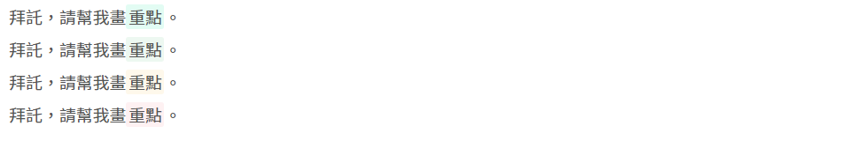
雖然我準備了四隻螢光筆,但其實我只用過一隻 XDDD 而且這樣一列才發現,一跟二的顏色太相近了。算了,之後要用其他顏色的時候再來調整。

實作

相比 Alert,Highlighting 的實作就簡單多了。

1. 顏色

一樣先到 \_sass\_variables\custom.scss 中,設定螢光筆顏色。

1
2
// highlighting  colors
$highlighting-default              : #e6fcf2;

2. 本體

再回到 \_sass\_custom\custom.scss 中設定本體。 如果不算 warning 選擇器的部分,程式碼只有四行而已。

其中需要注意的是white-space,我之前把它的屬性設成了 nowrap,導致當 highlight 較長文句時,該句不會換行,使的文句超出頁面(#5)。

1
2
3
4
5
6
7
8
9
10
.post-body .highlighting {
  padding: 0 2px;
  white-space: pre-line;
  border-radius: 2px;
  background-color: $highlighting-default;

  &.warning {
    background-color: $highlighting-warning;
  }
}

使用

在文句中需畫螢光筆的地方,插入下列程式碼,就可以看到相對應的效果了。

Highlighting

1
拜託,請幫我畫<span class="highlighting">重點</span>


Highlighting

1
拜託,請幫我畫<span class="highlighting warning">重點</span>


HTML <mark\> Tag
後來發現用 HTML 的 mark Tag 來實做效果會更好,所以又做了另外一篇:
- 【技能樹栽種】 HTML Mark Tag 實作 Highlighting

參考資料

  1. themes note.styl。檢自 kanboo/kanboo.github.io (2019-12-16)。
  2. PJCHENder (2016-09-07)。[技術分享] CSS中的多重選擇器(Multiple Selectors)包含空白或逗號。檢自 PJCHENder 那些沒告訴你的小細節 (2020-02-09)。
  3. MDN contributors (2019-12-10)。border-left 。檢自 MDN web docs (2020-02-09)。
  4. MDN contributors (2019-12-20)。:not()。檢自 MDN web docs (2020-02-09)。
  5. CSS white-space 属性。檢自 W3school (2020-02-09)。

更新紀錄

最後更新日期: 2020-08-14
  • 2020-08-14 更新 新增超連結顏色
  • 2020-02-09 發布
  • 2020-08-13 完稿